


Dyslexia is a common learning disability in children. There are several types of dyslexia, all of which interfere with the acquisition of reading and writing skills. Some solutions such as Storyplay’r exist to help dyslexic children learn to read and write.
Which font is the best for dyslexic children?
Dyslexia is a difficulty in learning to read and spell. It is generally detected in the first years of primary school (CP and CE1). Among the tools to facilitate learning for dyslexic children, fonts can sometimes play an important role. Which font should be chosen for dyslexic children? Is there a better font for dyslexics? What about font size? What you need to know about fonts and dyslexia.
What is dyslexia?
Dyslexia is a learning disability that causes reading and spelling difficulties in children. It is detected in the early years of primary school and takes different forms, but is never related to intelligence. There are two types of dyslexia:
– Phonological dyslexia: this is manifested by a difficulty in making the link between the grapheme and the phoneme. This is referred to as a dysfunction of the assembly pathway.
– Surface dyslexia: this is a difficulty in memorizing the image of a word. It is also referred to as a dysfunction in the addressing pathway.
In phonological dyslexia, symptoms include
– An inability to order letters, words, or syllables;
– An inability to distinguish between visually similar graphemes;
– An inability to distinguish between morphologically related words.
Read too: Storyplay'r a reading assistance for dyslexic children
Can displaying the text help the child?
It is clear that displaying the text can definitely help the child recognize letters, graphemes, words, and sentences. Removing serifs and making the bottom of letters bold will, for example, make it easier to distinguish between letters that look the same. For example, the overall shape of the text is important in order to focus the child’s eye and thus avoid visual distraction or permanent disruptive eye movement. By the form of the text, we mean its layout, i.e. the line spacing, the choice and size of the font, the background of the page, the spacing between words…
Laetitia Branciard, vice-president of La Fédération Française des Dys, says: « As long as others don’t know that letters move in front of your eyes and that they are distorted, you look like a moron, no more and no less. There is still a huge amount of information and training to be done. Do we know that 50% of primary school children with a learning disability are depressed? […] To try to remedy this, we are working with publishers on certain graphic adaptations, which are essential for Dys, and unknown to the visually impaired: adapting the font, the line spacing, the distance between words, and the non-justification of texts. For the little ones, practice colored syllabification. These are ways of helping these people to develop and maintain reading practice. Those who are less prevented from reading than others will thus be able to manage the written word, the screen, and the voice synthesizer at the same time. They will read on their own for a while, and then, when they are tired, they will listen to the voice. (Article from the French Ministry of Culture Rentrée littéraire : mobilisation pour rendre les nouveautés disponibles aux lecteurs empêchés, in French)
To help a dyslexic child learn to read, the choice of font that gives the letters their shape is therefore one of the visual elements to take into consideration.
What is the best font for dyslexics?
While fonts can be important for dyslexic children, our research into the literature does not allow us to give you the ‘miracle font’ or fonts that will solve everyone’s reading problems.
A choice that depends on the child’s preferences
The choice of font for dyslexic children often seems to be an individual one, with each child having a preference for a particular font. Below are a number of fonts that have been identified as suitable for certain dyslexic children.
Some fonts have been identified as being more suitable for dyslexic children: these are the so-called sans-serif fonts, where the characters are stuck (or sans-serif), such as Arial, Verdana, and Tahoma.
Designed for children, Comic Sans is also very popular among dyslexic people, although no study has shown that this font improves the readability of a document significantly. Some find it too childish, too bold, or too informal. However, it is one of the most legible fonts in Windows, as its letters are easily identifiable.
Sassoon is less common and was designed for early reading and is very popular for Montessori materials. Andika was designed for budding readers and is suitable for dyslexic children for literary use.
Sometimes the simplest and most common fonts can be very suitable: Helvetica, Courier, or Arial and Verdana, mentioned above.
What do health and education professionals think about the link between fonts and dyslexia?
While fonts can help a dyslexic child read and decipher text, there are no proven recommendations from experts, only suggestions. Indeed, some assume that the choice of font depends on the individual child and their specific needs: « There is no magic potion. It is preferable and beneficial to work with the dyslexic person to find the subtle mix that suits them and makes them feel comfortable in their task, » advises Elisabeth Weber-Pillonel, president of the association Dyslexie Suisse Romande.
Others believe that the typography can make a difference. This is the case of Elvio Fisler, a specialized teacher with a passion for computers, who noticed that his pupils were unable to decipher the questions in a game he had just installed on the class computer: « The font was unsuitable for those who had difficulty reading. So I found a way to get into the software and change it. It worked. Then relatives and teachers asked me to help them, something had started. »
Focus on fonts designed for dyslexics: OpenDyslexic and Dyslexie©
Two fonts developed by graphic designers appeared in 2011, one for a fee, the other free: Dyslexie© and OpenDyslexic. They work by removing serifs, aerating, and spacing characters to avoid confusion, and bolding the bottom of letters to anchor them in the text.
Alberto Gonzalez, creator of the OpenDyslexic font, explains: « At the time, most fonts were reserved for publishers. I wanted to make something that my wife and I could use, and that could eventually be shared with others. » Encouraged, he chose to release his typeface freely « to test if and how such a font worked by collecting a lot of empirical data », but also « to allow studies to be conducted on it without cost barriers ». Each letter of the OpenDyslexic font is differentiated from the others to avoid confusion, notably by a particular thickening of the line on the front and back of the letters.

The size of the font: another essential criterion for dyslexic people
In addition to the choice of font, size is also important. This includes the size of the characters, but also the length of the lines, and the alignment of the text. Dyslexic people, especially children learning to read, are sensitive to the whole layout. It helps children considerably and makes texts more accessible. Children tend to prefer bright, spaced-out text to black or dark type.
What fonts can I find on Storyplay’r?
Storyplay’r is for everybody and adapts to everyone. With this in mind, we have chosen to make five fonts available: Times New Roman, Helvetica in lower case, and capital letters, and two fonts adapted to dyslexic children or those with deciphering difficulties, Courier and OpenDyslexic. These fonts are present on all the books on the platform, without exception. Thus, each child can choose the font that suits them to read easily and get into the story more easily.
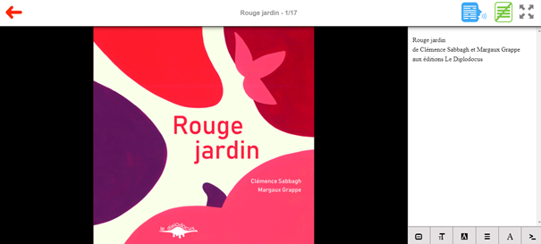
How does it work in practice? To display the different fonts available on Storyplay’r, you must first display the text. Here are the steps to follow in detail:
1. Open a book ;
2. Click on the « Text » tab in green, located on the top right of the screen: the text of the story appears next to each page of the book;
3. Then change the font by clicking on the tab « A » on the bottom right. Each time you click on it, a different font is displayed. Scroll through the five fonts and choose the one that suits your child best.
If you also want to change the size of the font, just click on the tab « T » and scroll through the different sizes.
Happy reading on Storyplay’r!


